

Choosing the right paint color for your home can feel like a daunting task. I’ve been there—staring at endless paint chips, unsure whether I should go bold or play it safe. The colors you choose will set the mood, open up the space, or even make a room feel more cozy.
But here’s the good news: once you know the key factors and a few tricks, the process becomes a lot easier and more enjoyable. In this blog, I’m sharing exactly how to choose paint colors that’ll transform your space into something that feels just right.
Why Choosing the Right Paint Color Matters
Choosing the right paint color isn’t just about picking a shade you like—it’s about creating a space that feels good, both visually and emotionally. I remember the first time I painted my living room, I went with a bold red. It looked great in the store, but once it was on the walls, it felt overwhelming.
That’s when I learned that paint colors can completely change how a room feels. The right choice can brighten a room, make it feel larger, or even add an intimate touch. So, how do you get it right?
How to Choose Paint Colors: Start with the Basics
Before you grab those color samples, think about these main points:
What’s the Mood or Purpose of the Room?
What kind of vibe do you want to create? In high-traffic areas like living rooms, warm colors like reds, yellows, and oranges can add energy and warmth. But for private spaces like bedrooms or offices, cooler shades like blues, greens, and neutrals are calming and great for relaxation.
Take my bedroom, for example—I went with a soft, light blue. It’s soothing, and it helps me wind down after a long day. In contrast, my kitchen is painted a warm yellow that makes the space feel inviting and energizing. Deciding the mood first can help guide your color choices.
How Does Lighting Affect Your Space?
Lighting plays a huge role in how colors appear. I learned this lesson the hard way when I painted my bathroom a rich navy blue, thinking it would be deep and elegant. But the bathroom had only one small window, and the color ended up looking darker than I wanted.
In general, rooms with north-facing light get cooler, bluish tones, so warm colors (like reds and yellows) work better. Rooms with south-facing light have warmer, yellowish tones, so cool colors (like blues and greens) can balance that. Always check your color samples in natural and artificial light at different times of the day before committing.
How Does Room Size Affect the Paint Color?
The size of a room is another consideration when choosing paint colors. Light, airy colors can make a small room feel larger and more open, which is why I love using soft whites or light pastels in tight spaces. For larger rooms or spaces you want to feel cozier, darker shades can add depth and intimacy.
Think about the overall feel you want for each room and choose accordingly.
How to Choose Paint Colors: The Practical Process
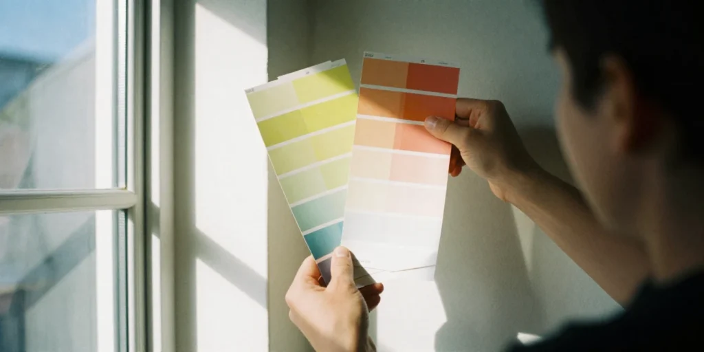
Use the Color Wheel to Guide Your Choices
The color wheel is your friend when it comes to selecting paint colors. If you’re unsure where to start, here are some color schemes you can play with:
- Monochromatic: This involves using different shades, tints, and tones of a single color. It’s a timeless and harmonious way to decorate. I’ve used a range of blues in my home and love how cohesive it looks.
- Analogous: These are colors that sit next to each other on the wheel (like blue, blue-green, and green). They create a calm and harmonious feel in any room.
- Complementary: Colors that are opposite each other on the color wheel (like blue and orange) create a bold, energetic contrast. It’s perfect if you want to make a statement.
The 60-30-10 Rule: The Secret to a Balanced Room
Here’s a rule that’s easy to follow and always works: the 60-30-10 rule. It’s a design principle where:
- 60% of the room should be the dominant color (walls).
- 30% should be a secondary color (furniture, window treatments).
- 10% should be an accent color (art, accessories, cushions).
I use this rule whenever I’m setting up a room. It helps me keep everything balanced and ensures that no one color overpowers the space.
Test It Out First: The Importance of Sampling
Never skip this step—trust me, I’ve learned the hard way! Before I made my final decision, I always test the paint colors in my actual space.
Apply large swatches on your walls and observe them in different lighting conditions. Let the paint sit for a couple of days so you can see how it looks at various times of the day. This way, you’re more likely to end up with a color you’ll love.
Don’t Forget the Finish: Matte vs. Satin vs. Glossy
The finish (or sheen) of the paint is just as important as the color. Here’s how I decide which finish to use:
- Matte finishes are great for hiding imperfections but are best for low-traffic areas like bedrooms.
- Satin or semi-gloss finishes offer a subtle sheen, are durable, and easy to clean, making them perfect for high-traffic areas like kitchens or bathrooms.
Make sure the finish complements the room’s function and style.
FAQ: Answers to Your Paint Color Questions
1. How can I make a small room look bigger with paint?
Use light or pale shades like soft whites, light grays, or pastels. These colors reflect more light, making the room feel more spacious. You can also paint the ceiling a lighter color to give the room more height.
2. What’s the best way to choose a color if I don’t know what I want?
Start by thinking about the mood you want for the room and the room’s purpose. Use the color wheel to help find complementary or analogous colors. And don’t forget to sample those colors in your space before deciding.
3. Should I match my wall color with my furniture?
It’s not necessary to match exactly, but you should ensure that your wall color complements your furniture. For example, if you have dark furniture, light walls can help balance the space, while dark walls with lighter furniture can create a dramatic effect.
4. How do I choose paint colors for a house with open-plan living?
With open-plan living, choose a neutral color that flows seamlessly from room to room. You can add accent colors or bolder shades in smaller sections of the space, like the dining area or living room, to add interest and personality.
Final Thoughts: Finding Your Perfect Color
Choosing paint colors doesn’t have to be stressful. Once you know how to assess the mood of the room, consider how light will affect the space, and use a little color theory, you’ll be on your way to creating a space that feels perfect for you.
Trust me, it’s all about trial and error, but with these tips, you’ll get it right every time. Now, go grab your favorite paint swatches, and let the fun begin!